Venus Bank
How symbolism and behavioural UX can make finance more empowering

“I’m a woman, can’t you see what I am”? Financial applications still don’t hear Nina Simone’s message, I designed an application that does.
Most banking apps assume all users interact with money in the same way. But women often manage irregular income, face cultural taboos around money discussions, make family financial decisions, and invest their money.
So my goal was to design an app that reflects their behaviours and needs.
Venus Bank
I designed Venus Bank, a financial app combining:
Symbolism: Venus’s themes (femininity) through rounded shapes and a pop culture-inspired colour palette
Behavioural UX: Features organised by actual usage data (e.g., demoted unused "advanced stats").
Tools:
Figma; Zoom
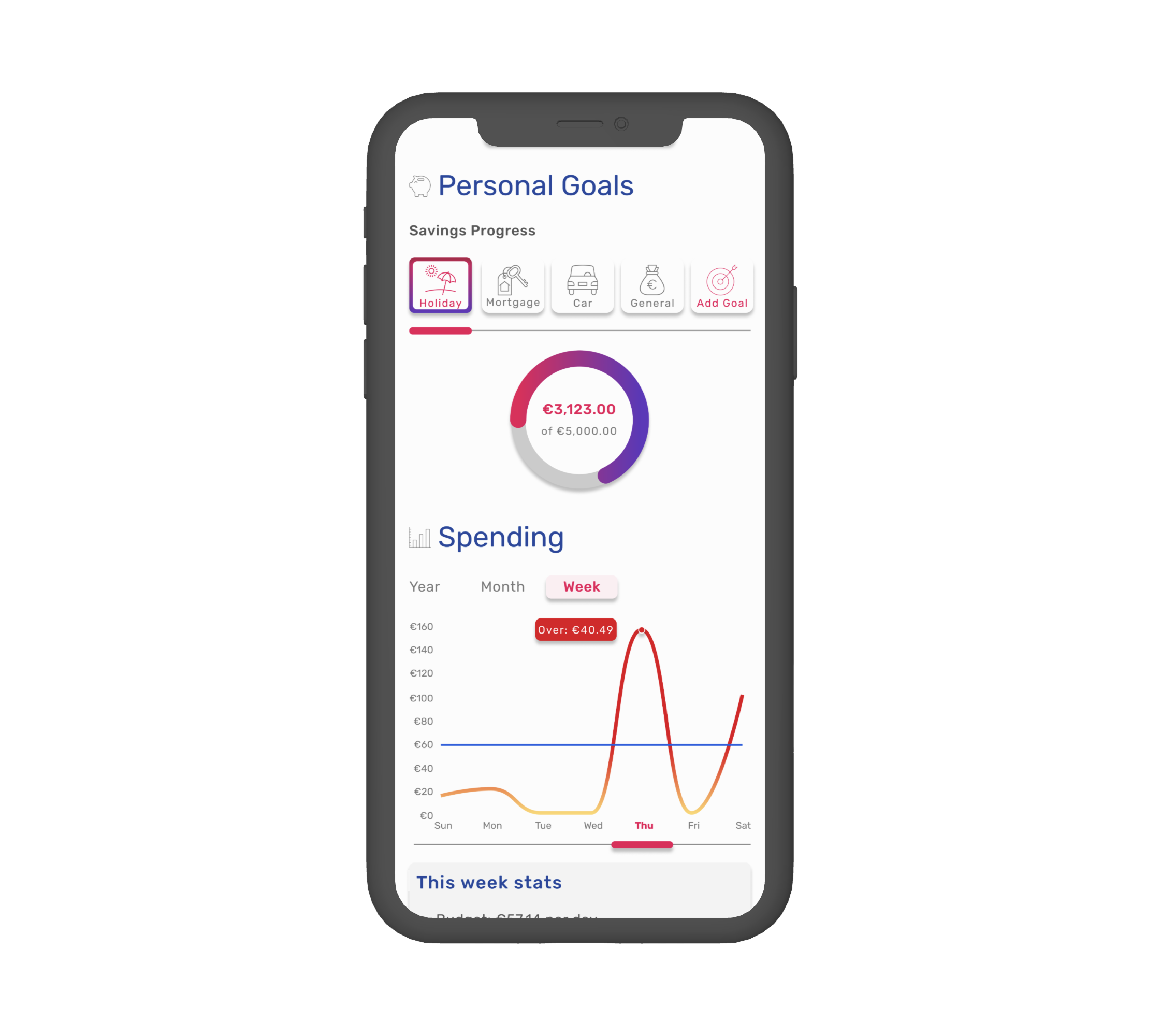
Transaction History
I had time and resource constraints, so I chose simple lined icons.
Lesson learnt: I'm going bold from day one with 3D icons besides transactions and generous spacing. I can already picture that.
Adjustments

I prioritised frequent actions (transfers, balances) on the main screen.
And decided to tuck stats into a secondary tab. By making these decisions, I simplified navigation, reduced clicks and steps.
However, today I'd have usability tests with users to investigate features like "blurred card" on the home screen, as it could be confusing to the users.
Savings & Stats

I designed a progress wheelbar for goal visualisation, and used intuitive icons to replace for instant recognition.
Red/Yellow for alerts.
Decisions
-
![]()
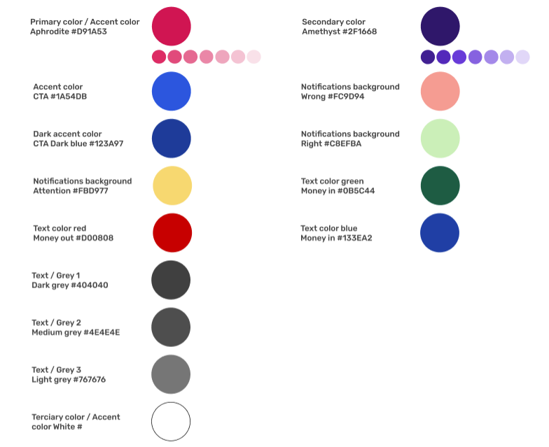
Color
Traditional apps use harsh reds for "money out," amplifying financial stress.
Raspberry (#D91A53) as the primary colour: Feminine, vibrant, and it retains attention without anxiety.
Growth-focused green (#2F1668) for deposits: Creates a "visual reward" to boost engagement.
Yellow/red sparingly for critical alerts.
-
![]()
Typography
I prioritised readability and the brand's principles of cleanliness, playfulness, and trustworthiness. I ultimately chose Rubik for its versatility, various weights, and modern touch. It perfectly aligned with the project's needs and the brand's values while being readily available as a web font.
-
![]()
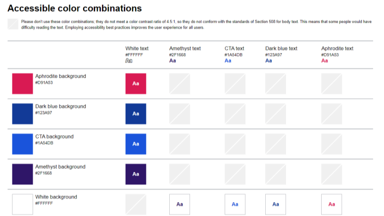
Accessibility
Accessibility tools confirmed readability, but today I’d test colour psychology earlier with low-fi prototypes and explore how cultural perceptions affect colour associations.

Key Takeaways & Conclusion
Playful icons accelerate the recognition and act as visual rewards, increasing users’ satisfaction.
Focus on the primary goals and interactions, reduce cognitive load and less friction.